Refusing the default AI look for a marketing agency
Every AI company looks the same — dark navy, glowing gradients, a starfield. I designed the first direction that way, then argued us out of it.
- Role
- Product designer — research, moodboard, wireframes, three UI directions, final build
- Timeline
- 2026
- Team
- Solo, direct with the founder
- Platform
- Responsive marketing site
- Status
- Delivered
The problem
An AI marketing agency needed a landing page that made them credible to buyers — in a category where every competitor uses the identical dark, glowing, sci-fi visual language.
The outcome
Three explored directions, ending on a bright, editorial, data-led page whose proof is charts and outcomes rather than atmosphere.
If you read nothing else
The client came inbound through LinkedIn — the portfolio did the selling before I ever spoke to them.
My first direction was the category cliché. Recognising that, and pitching against my own work, was the actual value I added.
The final page argues with evidence: real charts, real numbers, a visible process — instead of a glowing orb and the word 'intelligent'.
Open ten AI company websites and you will see the same page ten times: near-black background, a blue-violet gradient, a glowing abstract shape, and a headline promising to be smarter and faster. It looks like the future. It also looks like everyone.
How it came in
A message on LinkedIn
Tangentix found me through LinkedIn and reached out directly — no agency, no brief document, just a founder describing what the business does and what the site needed to achieve. That shaped the engagement: I was talking to the person who owned the decision, which meant directions could be argued on merit rather than filtered through a committee.
Understanding the buyer
Who actually reads an agency landing page
Tangentix blends AI automation with human marketing expertise — media analytics, lifecycle marketing, campaign execution. The people evaluating that are marketing leads with a budget and a healthy suspicion of AI claims, because they have been promised transformation before.
So the page has one real job: move a sceptical buyer from “another AI vendor” to “these people understand my numbers.” Atmosphere doesn't do that. Evidence does.
The turn
I designed the cliché first — then argued against it
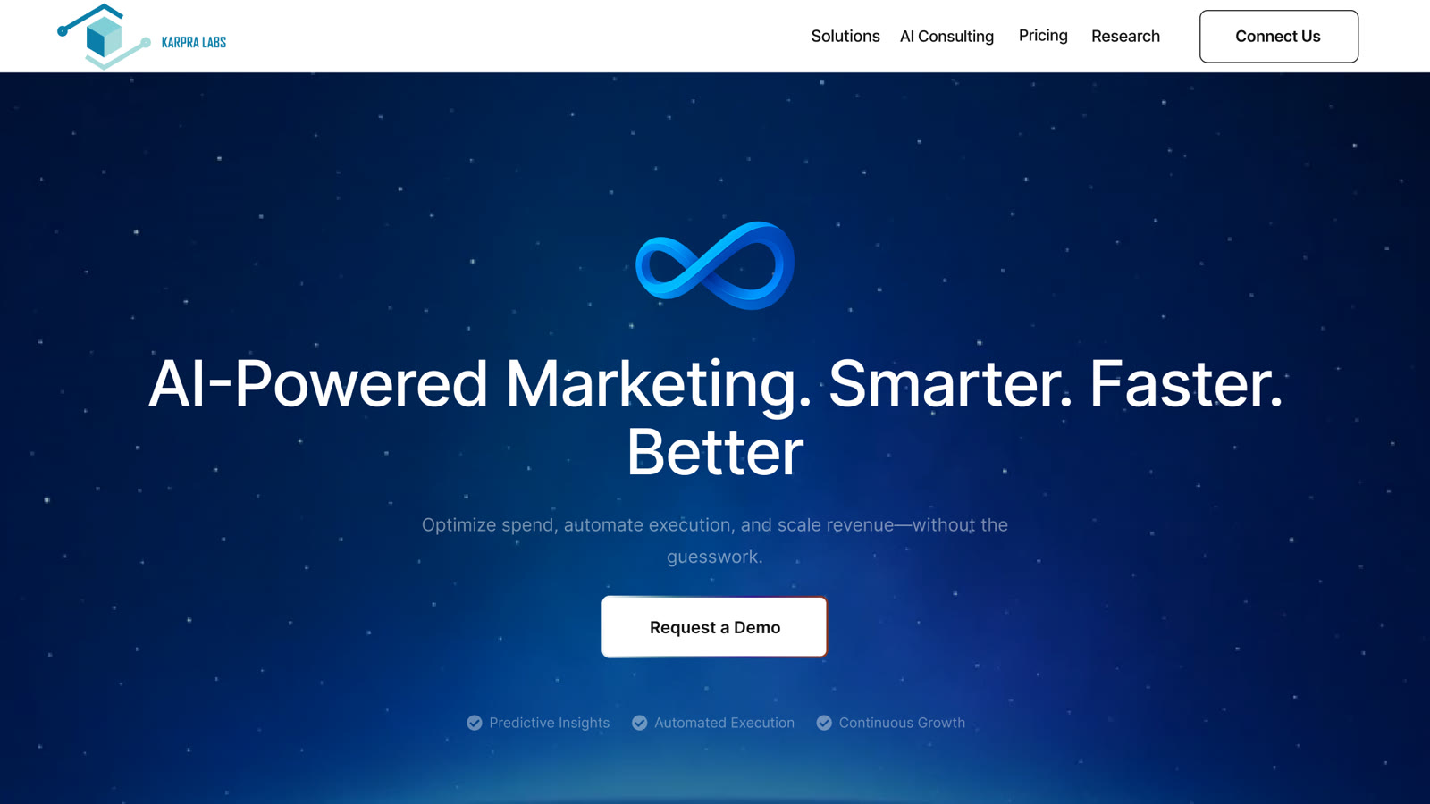
My opening direction did exactly what the category does: dark navy, a starfield, a glowing 3D infinity mark, “AI-Powered Marketing. Smarter. Faster. Better.” It's competent and it's completely forgettable, because it is indistinguishable from every competitor a buyer had already seen that week. Sameness isn't a style problem, it's a positioning problem — and the fastest way to be ignored is to look exactly like the thing someone is already sceptical of.
Direction 3
Bright, plain, and led by the data
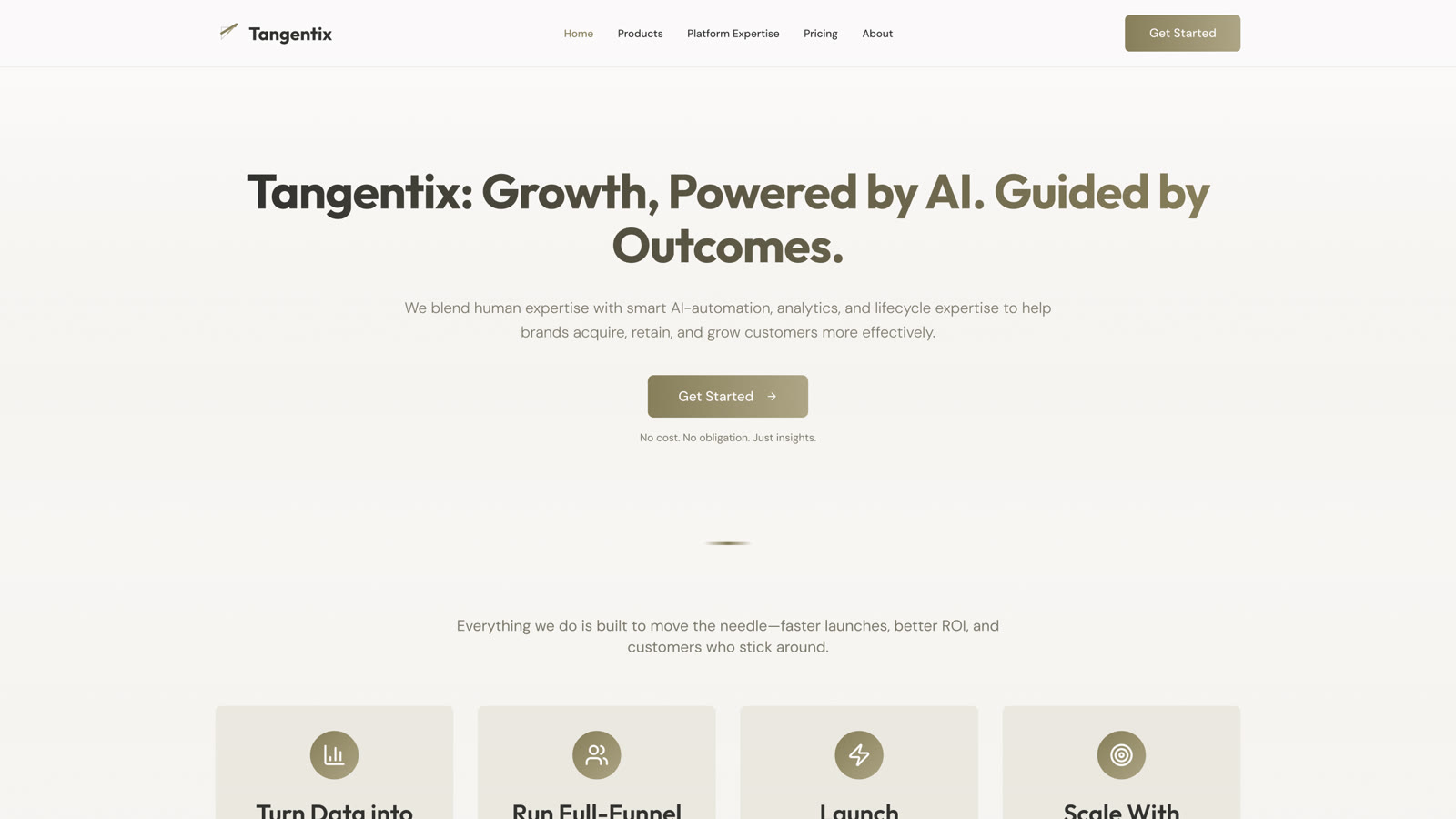
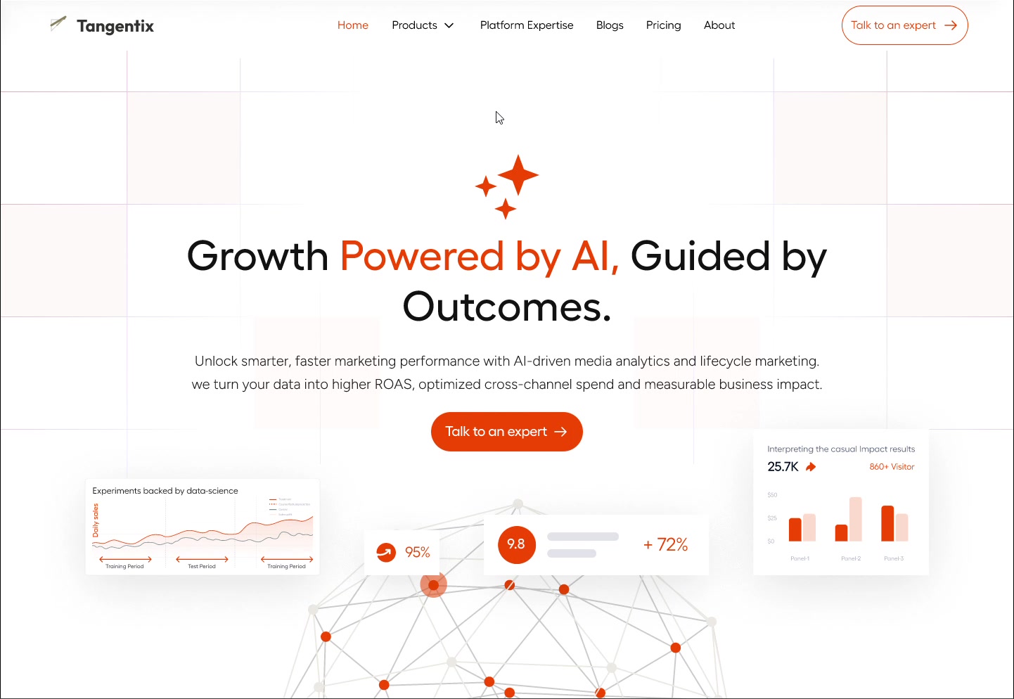
The final direction keeps the second's confidence in light and space, but gives it energy and evidence. White ground, a single decisive orange, and — most importantly — the hero is built from the actual work: an experiment chart, a causal-impact readout, a lift percentage, a network of channels. The first thing a visitor sees isn't a metaphor for intelligence; it's the shape of the reporting they'd receive.
Design principles
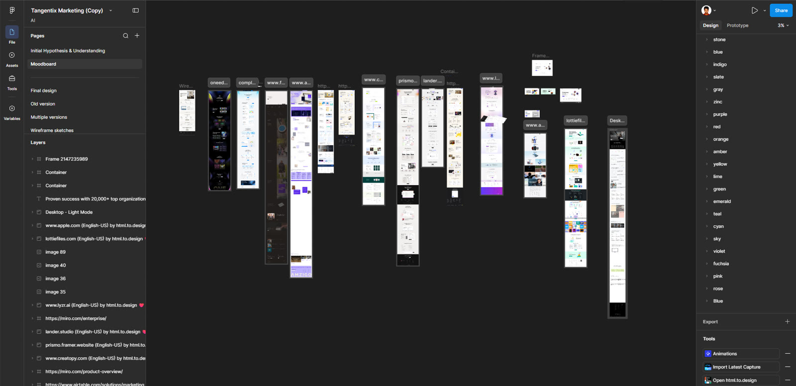
What kept the page honest
Show the artifact
Every claim is anchored to something that looks like real output — a chart, a metric, a step in the process. Buyers trust artifacts more than adjectives.
One colour, spent carefully
A single orange marks only what matters: the CTA, the key phrase, the live data points. Restricting it means it never stops meaning “look here”.
Legible over atmospheric
No dark gradients to hide behind. A bright page has nowhere to conceal weak content, which forces the copy and the proof to carry it.
Key decisions
The calls that shaped it
Present the category cliché, then reject it
WhyShowing the expected direction first wasn't wasted work — it made the argument concrete. It's far easier to agree “this looks like everyone else” when you're looking at it than when it's an abstract warning.
Put charts in the hero instead of an abstract graphic
WhyThe buyer's question is “can you move my numbers?” Leading with an experiment chart and a lift percentage answers it in the first screen, where a glowing orb would only have set a mood.
Go light in a category that goes dark
WhyDifferentiation with a reason behind it: dark sites optimise for atmosphere, and this pitch depends on scrutiny. A bright page signals nothing is hidden — and stands out purely because the competition doesn't do it.
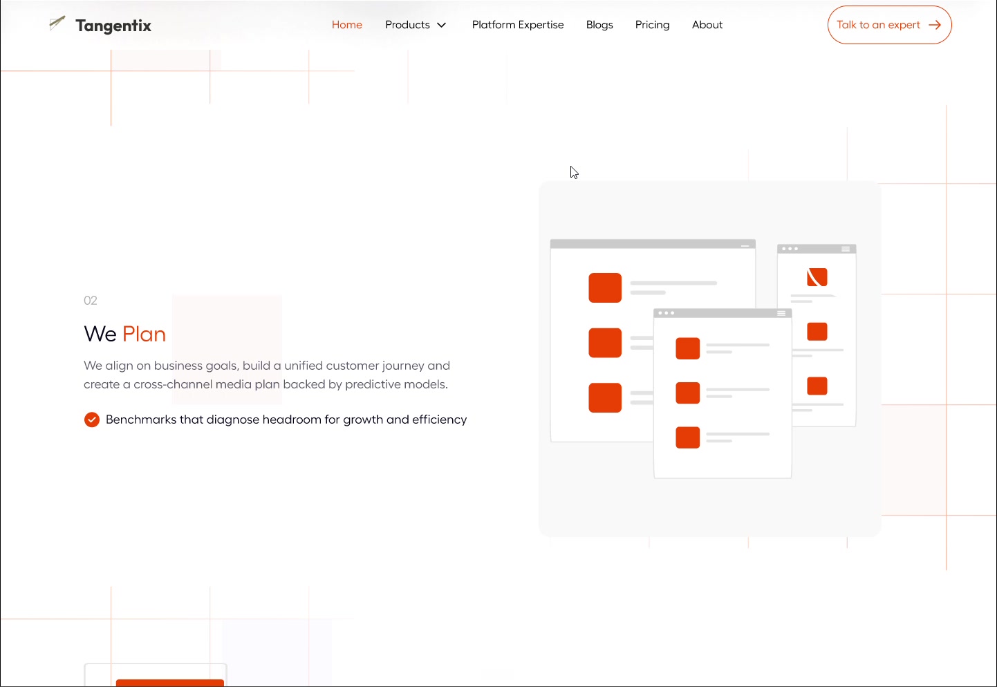
A four-step process section
WhyAudit, plan, execute, scale. Agencies get bought on confidence that there's a method, not just talent — naming the method converts scepticism into something a buyer can picture their own project moving through.
Where it stands
What I took from it
The most useful thing I did was disagree with myself
I could have shipped the first direction. It was competent, the client hadn't objected, and it looked like what an AI company is supposed to look like. Talking us out of it — with a second and third direction that made the alternative real rather than theoretical — is the part of this project I'd point at. Anyone can execute a brief; the value is in noticing when the obvious answer is the one that makes you invisible.
More case studies