Three versions of my own company's website
From a generic services list, to a bolder brand, to a site organised around the industries it actually sells to.
- Role
- Product designer — IA, visual direction, full site design across two rebuilds
- Timeline
- 2024–2026 · v1 ran roughly a year before the rebuild
- Team
- With PIPRA's marketing and engineering teams
- Platform
- Responsive marketing site
- Status
- Live — currently on the third version
The problem
PIPRA sells complex services — AI, blockchain, IoT, cloud — to enterprises like Motorola and Deloitte, but the site listed capabilities instead of answering the only question a buyer has: can you solve my problem?
The outcome
A site restructured around industries and outcomes rather than service categories, with a mega-menu that maps Services, Products, Solutions and Industries as separate ways in.
If you read nothing else
I got to see my own work age. Version 1 ran for about a year, which is long enough to learn what the design was actually failing to do.
The real fix wasn't visual — it was reorganising the site around the buyer's industry instead of our internal service taxonomy.
Each version solved the previous one's problem: the old site had no voice, v1 had voice but still sold features, the final sells outcomes.
Most redesigns you hand over and never see again. This one I had to live with — my own company's site, running for a year, with every weakness slowly becoming obvious.
Where it started
A capable company that read like a directory
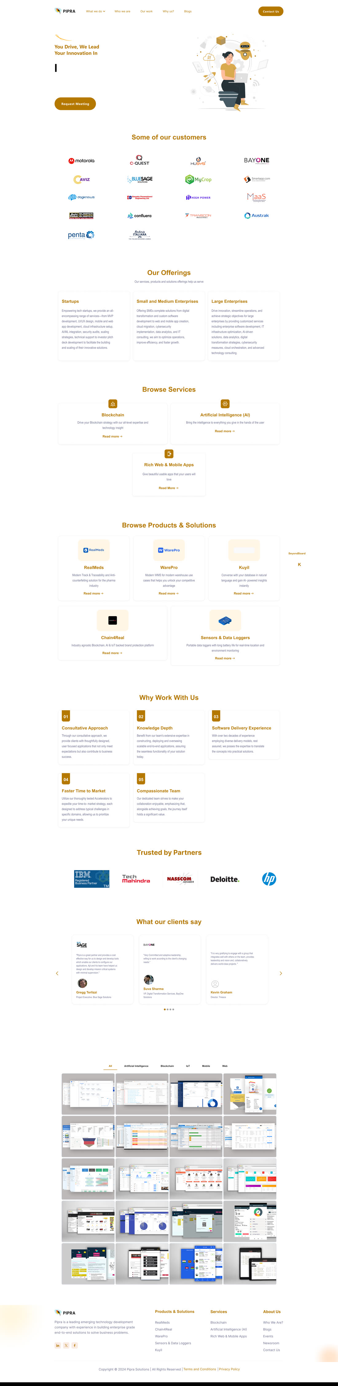
PIPRA builds serious things for serious clients — Motorola, Deloitte, IBM partnerships, NASSCOM membership. The original site had all of that on it, and somehow still felt generic: a cream-and-gold layout, a typing-animation headline, and section after section of lists. Offerings by company size. Services by technology. Products in a grid. Reasons to work with us, numbered.
Everything a buyer might want was technically present. Nothing was arranged the way a buyer actually thinks.
Version 1
First I fixed the wrong problem — and it still helped
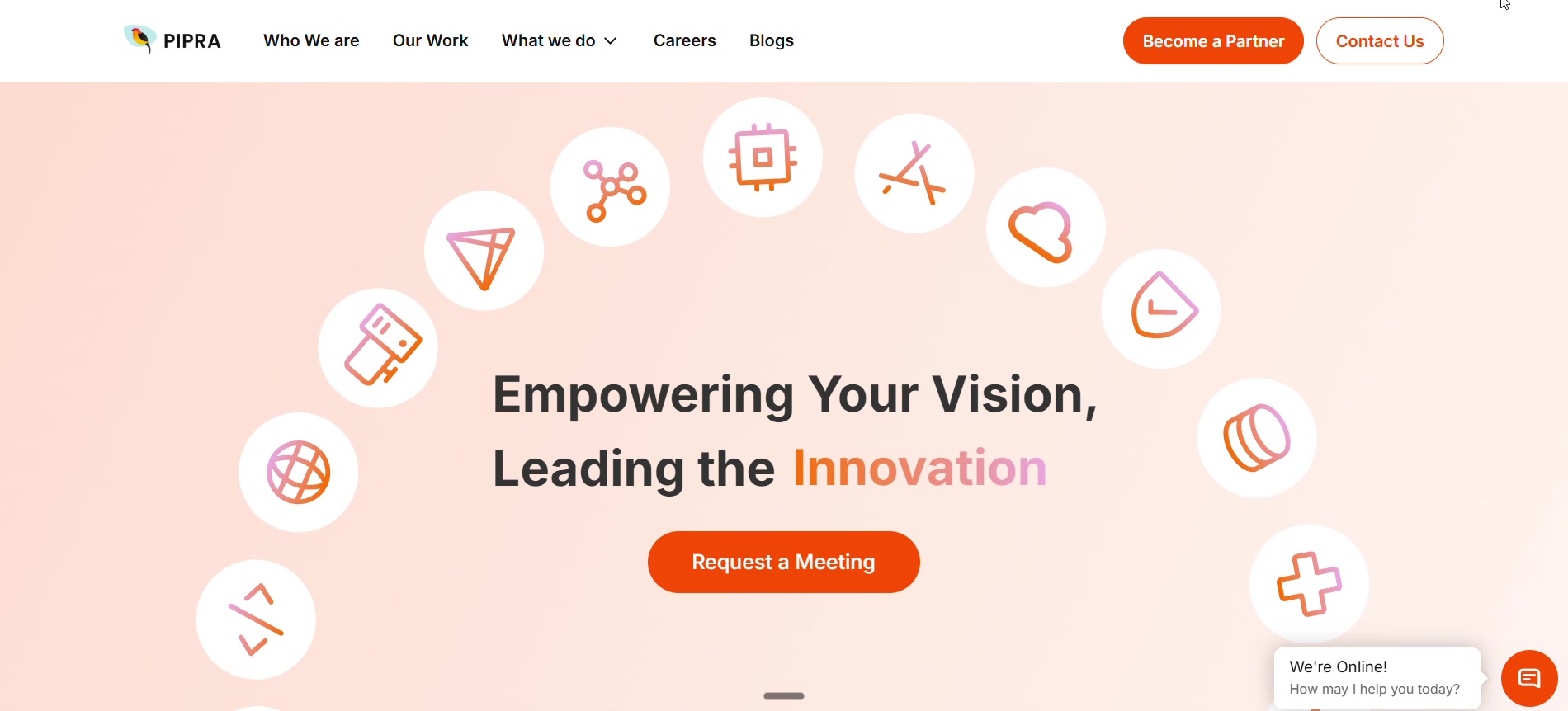
My first rebuild attacked the thing that was easiest to see: the site had no presence. So it got a real voice — a coral and orange identity, a confident headline, isometric 3D for the technical services, and dark sections that gave the page rhythm instead of an unbroken scroll of cards. It was a genuine improvement, and it ran for about a year. What that year taught me is that I'd made the same content look better without changing what the content was doing.
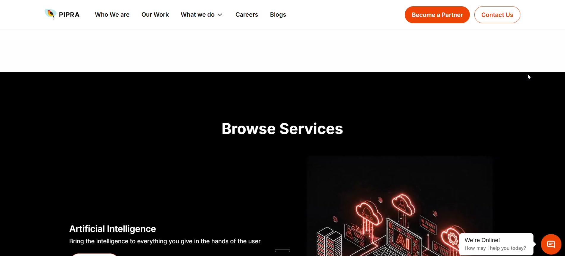
What the year taught me
Buyers don't shop by technology
A warehousing operations lead does not wake up looking for “Artificial Intelligence” or “IoT”. They have a problem — stock they can't see, deliveries they can't trace — and they're trying to find someone who has solved it in their industry before. Version 1 still sorted everything by our internal categories, so a visitor had to translate their problem into our vocabulary before they could tell whether we were relevant. That translation step is where people leave.
Design principles
What the rebuild had to do
Lead with their industry
A buyer should see their own world on the page — warehousing, agriculture, manufacturing — before they see a list of the technologies we happen to use.
Headlines are outcomes
“Turn Warehousing into a Competitive Advantage” beats “IoT Solutions”, because one names the result and the other names the tool.
Four doors, not one list
Services, Products, Solutions and Industries are genuinely different ways in, so the navigation exposes all four instead of flattening them into one menu.
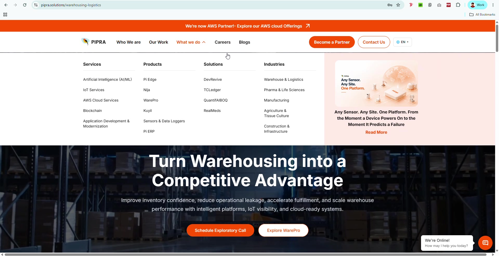
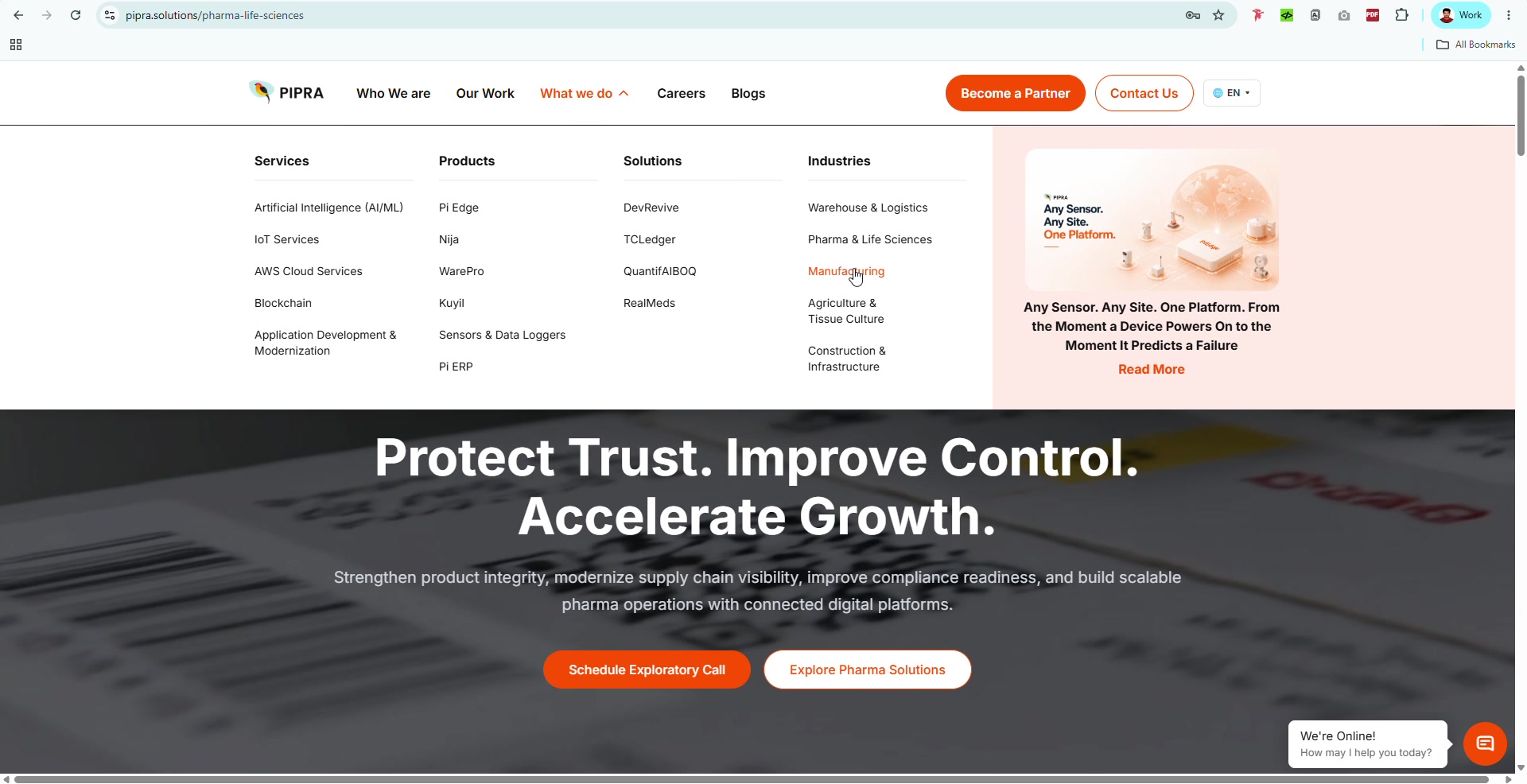
Key decisions
The calls behind the rebuild
Reorganise around industries, not technologies
WhyThe old structure required a buyer to know which technology solved their problem before they could find the page about it. Leading with industry removes that translation step — the fastest way to lose someone is to make them do your information architecture for you.
Write headlines as outcomes
Why“Turn Warehousing into a Competitive Advantage” tells a buyer what changes for them; the technology becomes supporting evidence rather than the pitch. It also forces the page to actually have a claim.
Go dark, and let the product imagery carry it
WhyThe earlier versions were light and busy, which flattened everything to the same weight. A dark ground makes the product renders and industry photography the brightest thing on screen, and reads as more enterprise-serious than coral did.
Put proof above the fold
Why“Endorsed by leading global enterprises” with real client logos sits immediately under the hero. For a mid-size firm selling to large ones, borrowed credibility is the single most persuasive thing on the page.
Keep one clear next step
Why“Schedule Exploratory Call” replaced the vaguer contact prompts. Naming the low-commitment action a buyer is actually willing to take converts better than asking them to define their own next move.
Then and now
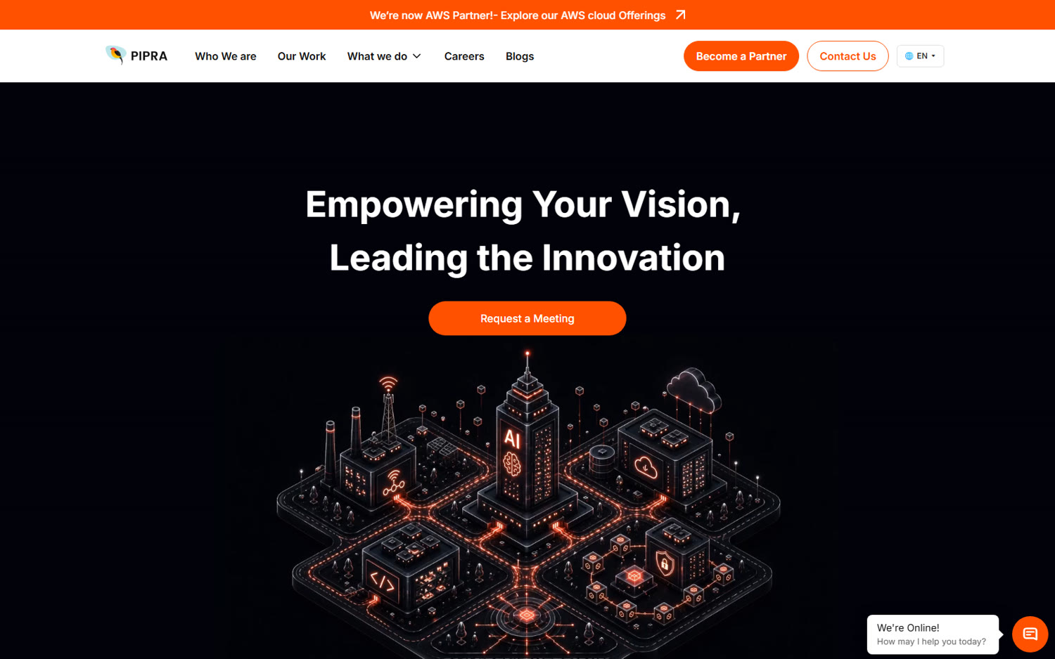
The first version and the current one
The identity
One image had to say what a page of copy couldn't
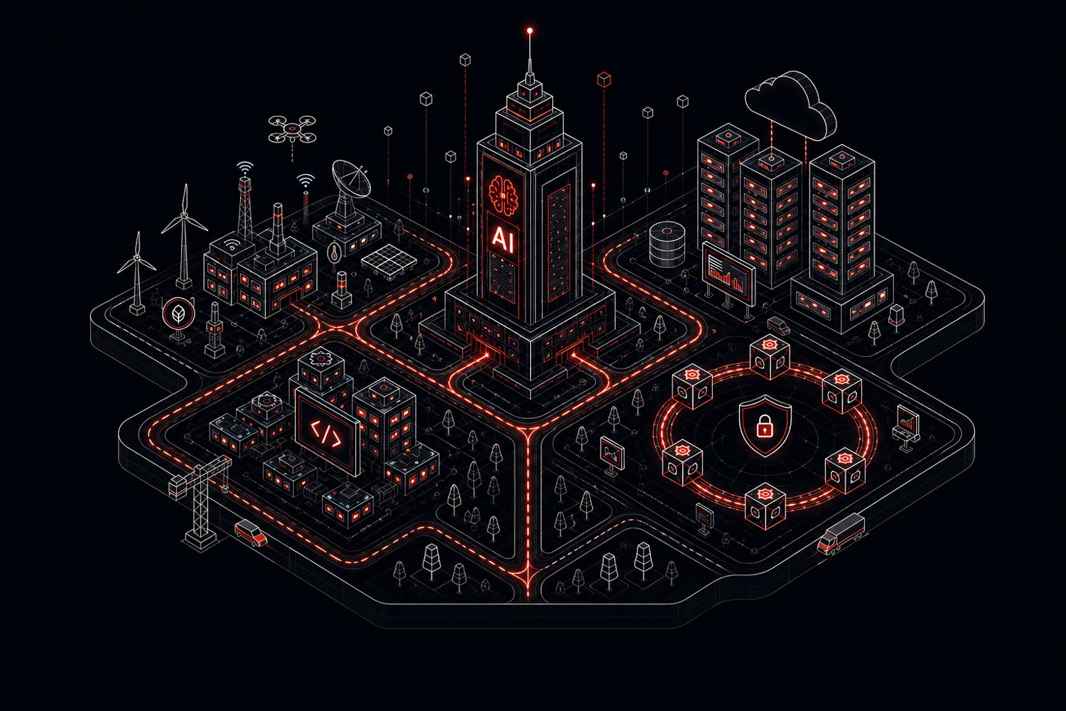
Before I touched the hero copy, I sketched the idea as a blueprint — a rough, wireframe-blue diagram of PIPRA as a place rather than a list: one central tower for AI, with the other capabilities — IoT, cloud, blockchain, security — as districts wired into it by the same glowing roads. Once that structure held together as a drawing, I named it: the City of PIPRA. Everything after that was refining the same idea, not replacing it.
I generated the artwork with AI from that blueprint, then iterated it — sharpening the skyline, adding the drone and wind turbines, working through which icons actually read at a glance versus which ones were just decoration. Once the still image was right, I fed it into an AI video tool to bring the city to life — lights travelling the roads, the cloud drifting, the AI tower pulsing — and that's the motion piece running in the hero today.

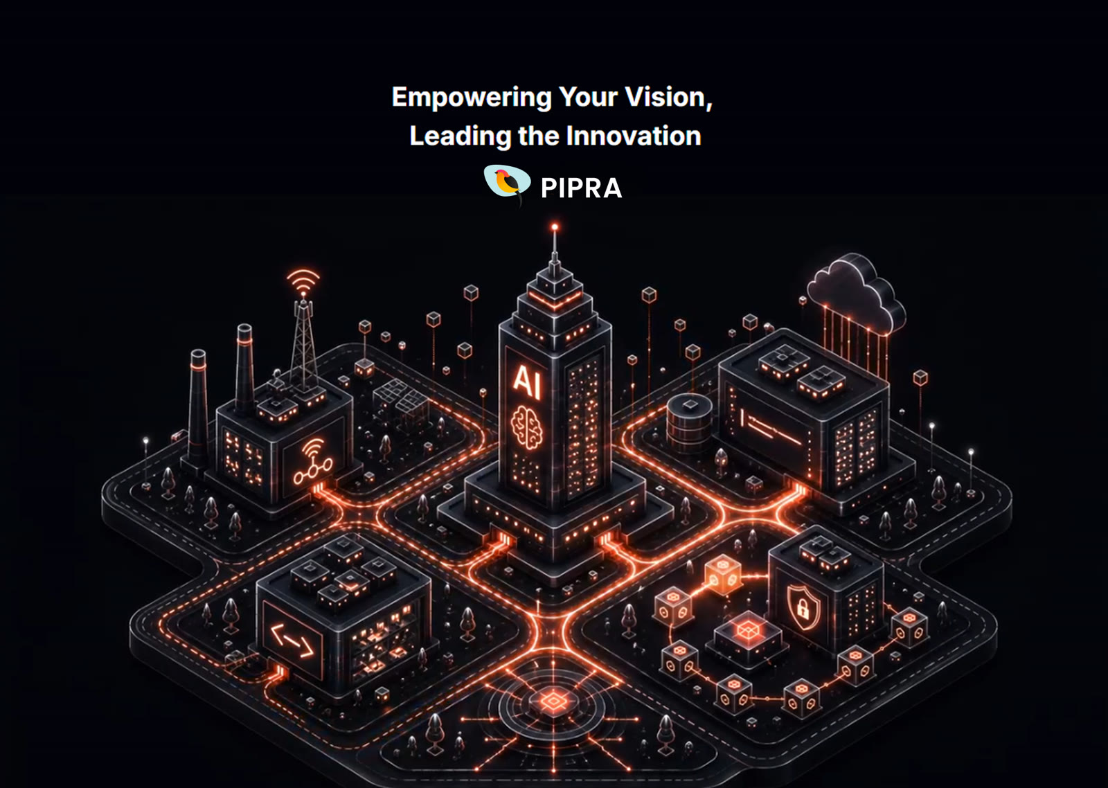
Where it stands
What I took from it
Living with your own work is the fastest way to improve
I've handed over plenty of designs and never learned whether they worked. Here I watched mine for a year, on my own company, and the flaw that surfaced wasn't one I could have seen in a review — the site looked good and still made buyers do the work of translating their problem into our language. Getting to fix that is the most useful feedback loop I've had, and it changed how I judge structure before visuals on everything since. The hero's city went through the same loop in miniature: a blueprint, a name, a still, and only then a motion piece — because none of it was worth animating until the idea underneath it actually held up.
More case studies