One institute, three pillars, two very different buyers
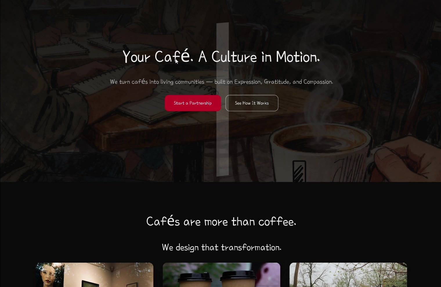
The same three-pillar programme sold to cafés and to corporates — two sites that had to feel like one organisation while speaking to buyers with nothing in common.
- Role
- Product designer — IA, content structure, UI for both sites
- Timeline
- 2026
- Team
- Solo, from the client's written content brief
- Platform
- Responsive marketing sites ×2
- Status
- Designed & handed over
The problem
Minimalist Institute runs one programme — Expression, Gratitude, Compassion — but sells it to café owners and to corporate CSR teams, two audiences who share no vocabulary, no motivation, and no budget process.
The outcome
Two sites on one skeleton: identical section architecture and pillar system, with the framing, imagery and outcomes swapped per audience.
If you read nothing else
The client arrived with a written content flow, not a design brief — my job was turning a document into an architecture without losing their voice.
I built both sites on one section skeleton, so the shared programme stays recognisable while each audience hears its own argument.
The philosophy chain intentionally diverges at the last link: cafés end at Loyalty, corporates end at Great Products.
Minimalist Institute has one idea — that Expression, Gratitude and Compassion can be built into a space rather than bolted onto it. The design problem was that they sell that same idea to a café owner and to a corporate CSR lead, and those two people want completely different things from the same sentence.
The starting point
A content flow, not a design brief
The client handed over a written structure for both sites — headlines, section order, the three pillars and their sub-points, and the impact line for each. That's unusually clear input, and it changed what I was being asked for: not to invent the message, but to give it a shape that lets a stranger absorb it in one scroll.
So my first pass wasn't visual. It was mapping their document into a repeatable section pattern and checking that every claim had somewhere to live.
The reframe
One skeleton, two arguments
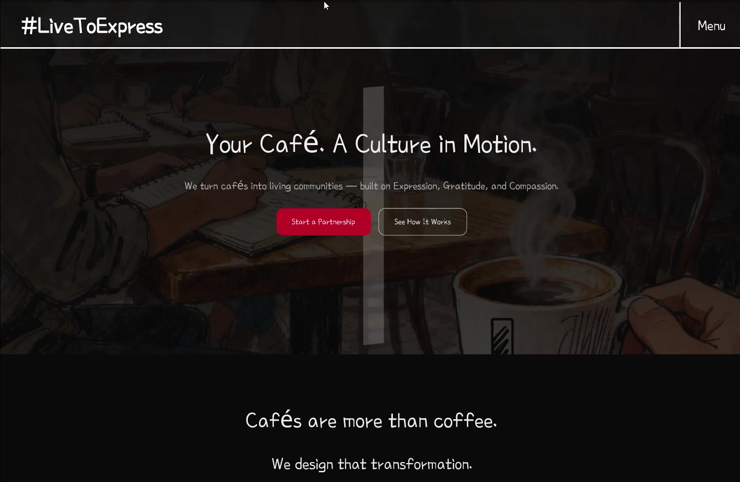
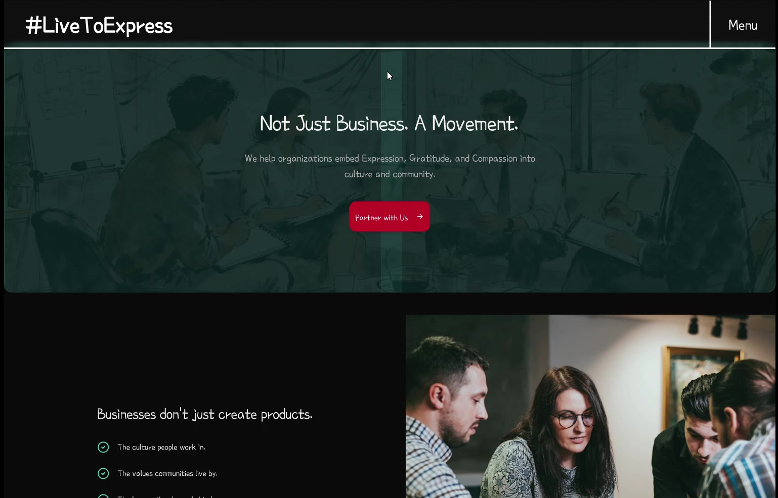
Rather than design two sites, I designed one structure and varied what fills it. Both run the same six beats — the why, our role, the philosophy chain, the three pillars, unified impact, and a call to action. Keeping the skeleton identical means the programme reads as one coherent thing across both audiences; changing only the framing and the evidence means neither audience feels like they're reading someone else's pitch.
Design principles
Rules for a two-audience system
Same bones, different voice
Section order and pillar structure never change. Only the headline, the imagery and the stated impact shift — so the offer stays legible while the pitch stays relevant.
Every pillar earns its impact line
Expression, Gratitude and Compassion each end with a concrete consequence for that buyer, because a values-led programme is easiest to dismiss as vague.
Show the room, not the concept
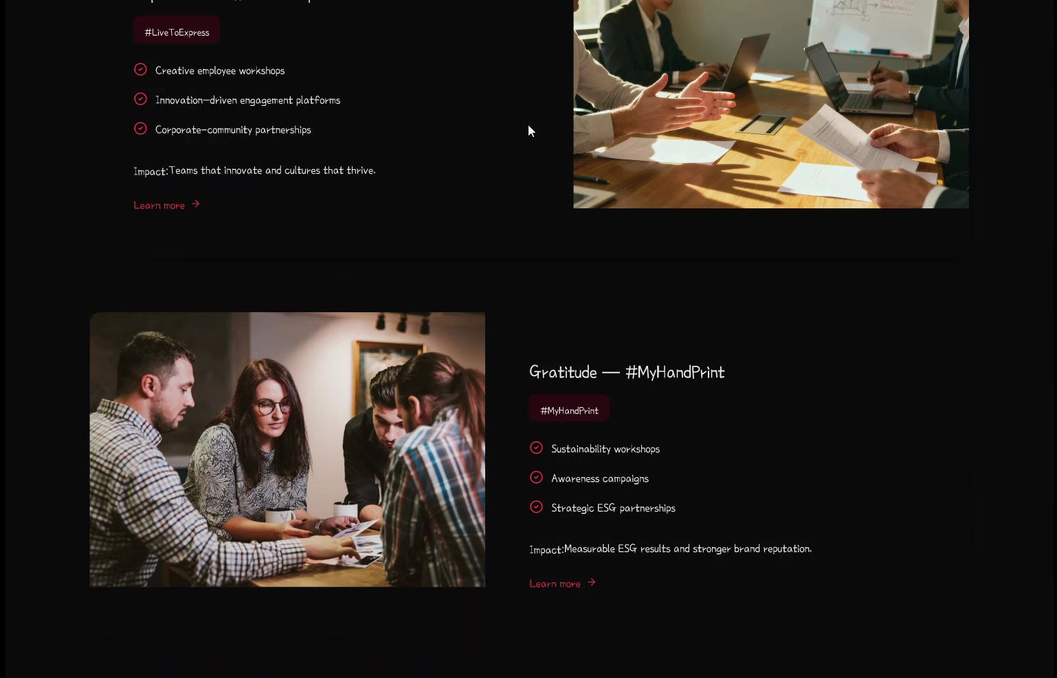
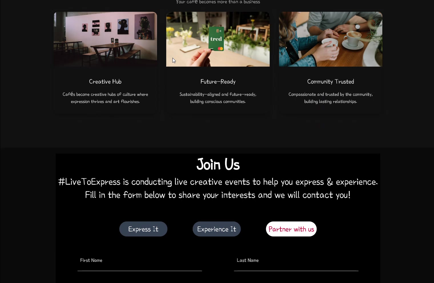
Photography carries real spaces and real people — a workshop, a café wall, a shelter drive — so an abstract idea stays anchored to something a buyer can picture happening in their own space.
The detail I like most
The philosophy chain ends in a different place
Both sites run a five-step chain that starts identically — Collaboration → Trust → Creativity. Then it splits. For cafés it resolves to Community → Loyalty, because a café owner is buying regulars. For corporates it resolves to Strong Teams → Great Products, because a CSR lead has to justify the spend to someone who cares about output. Same philosophy, same first three links, and the final step answers each buyer's actual question.
Key decisions
The calls behind the two sites
Hashtag the pillars rather than name them abstractly
Why#LiveToExpress, #MyHandPrint and #ForThePaws give each pillar a handle people can say, search and rally around. An abstract value is forgettable; a hashtag is a thing a café can put on a wall and a company can run a campaign under.
End every pillar with a stated impact
Why“Customers stay longer.” “Measurable ESG results.” Values-led offers get dismissed as fluffy, so each pillar closes with the outcome that buyer is actually purchasing — which is what turns a nice idea into a budget line.
Keep both sites dark, and let photography carry the warmth
WhyA dark ground makes the real photographs — a café wall, a workshop, a shelter drive — the brightest thing on the page. It also keeps two very different tones sitting inside one visual identity.
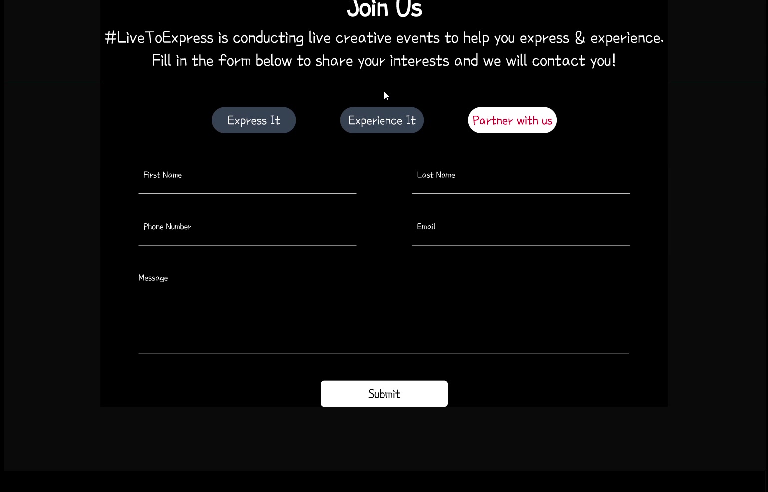
One CTA form, three intents
WhyExpress It / Experience It / Partner with us lets a visitor self-select how involved they want to be instead of forcing everyone through the same “contact us”. It also tells the client which kind of lead just arrived.
Where it stands
What I took from it
Structure is what makes a message repeatable
The temptation with two audiences is to design two things. Building one skeleton and varying the argument meant the client can add a third audience — schools, hospitals, anyone — without commissioning a new site. Designing the pattern rather than the page is the part that keeps paying off after handover.
More case studies